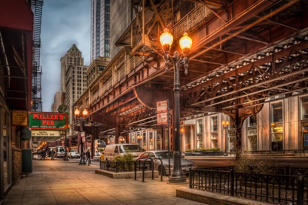
 Realism Digital Art is a term I use to describe the painterly and dramatic effects I’m striving for in my photography, utilizing Photomatix, Lightroom and Photoshop.
This one photo, taken in Chicago on the morning after St. Patrick’s Day, turned out as a surprise to me, as I was experimenting with combining various techniques: a cross-over of HDR-like photos in Lightroom and then a real tone mapped HDR in Photomatix:

Initially I had 7 shots from -3 to +3. This is the -1 unprocessed:
As you can see it is quite flat and the mood is far from the mood in the final photo. I had to shoot 7 shots, as it was really dark underneath that elevated train and the sky was extremely bright in comparison, even though there were heavy clouds over Chicago that day.
I tried processing with an HDR-like photo in Lightroom (you can read about how you do that in this article), but because of the wide dynamic range from very dark to very bright, I was unsuccessful. Either there was too little information in shadows or the sky was blown out. Instead, I decided make a true tone mapped HDR. At this time, this was what I had in Lightroom:
I had added a little artificial light to the sidewalk and buildings. This makes the photo a little more interesting for the eyes to wander around in (you might want to read about how I add artificial light in this article).
What I usually would do is to press reset and then export the 7 photos into Photomatix and do my usual process. But what I did in this case, was to synchronize my settings from the one photo to the six other photos as well. Lightroom has a simple and very fast way of doing that:
What you have to do is to select all of the photos you want to synchronize the settings to and include the one you have the settings on – seven photos all together in this case. Then click on the one that you have processed (the one with the settings) and then click on “Sync Settings” (or if you are in the Development module click “Sync…” I’s the same feature, just named two different things, depending on whether you are in the Library module or in the Development module). This gives you this dialog:
To synchronize everything, click on “Check all” and press Synchronize. If I just want to synchronize some of my settings, like some color balancing or maybe a crop or some other settings I have made, I always press “Check none” first and then select the settings I want to synchronize. This way I don’t happen to miss deselecting some setting I don’t want synchronized.
So now I had 7 exposures all post-processed in Lightroom using the HDR-Like post-process flow, and with some dodge and burn and a few other adjustments. I exported them into Photomatix and this is the tone mapped image I got from Photomatix:
Now, this is funky – I instantly recognized this as a Double Tone mapped image, even though it is only a single tone mapped image (if you want to know more about double tone mapped images, you might want to read this article). This got me thinking. The HDR-like processing I did in Lightroom evens out the differences between highlights and shadows (that is the purpose of HDR photography). So in a way this shouldn’t have been a surprise; I just made the first HDR image in Lightroom and the second in Photomatix. Normally I do both HDR’s in Photomatix Pro.
Another interesting thing about the tone mapping is that even the fairly subtle dodge and burns in Lightroom were accentuated in the tone mapping process. It’s part of what the double tone mapping does. Even small differences in lights and shadows become emphatic, and this can, in some photos, look fantastic, if well controlled – it easily can get out of hand in the double tone mapped image.
The raw output from Photomatix Pro was a a bit too extreme, so I had to dial it backwards a bit. A problem with the double tone mapped images is that strong light sources can become too accentuated: ![]()
Have a look at the side walk. The light souces are almost blown out. What I did to fix this, is to mix in one of the original 7 shots. I painted on a layered mask to blend the tone mapped image with one of the original shots like this:
And by painting over the problematic areas, I slowly fixed the problem. Each time I clicked, I added another 25% opacity of my brush to the area. By doing so gradually, instead of painting with 75% or 100% opacity, it was easier to control and to hide my strokes. You don’t want to be able to see strokes. You might want to read my articles on blending layers in Photoshop or blending layers in GIMP.
The rest of the photo I dialed slowly backwards in local areas. While I wanted to preserve the mood, I also wanted to get rid some of the extreme HDR by blending the various images into the tone mapped image.
Finally I applied some sharpening. For some reason, HDR often looks a little too unsharp for my taste. I therefore apply some sharpness using the Unsharp mask.
So that was the processing of this HDR. Remember that if you want to process similar photos, you need Photomatix and you can get 15% off Photomatix Pro if you use my discount code “caughtinpixels”. You can buy Photomatix right here.

